Select Page
Power BI Data Analysis Report – Bringing Insightful Information From the Raw Data of the Land of France

Power BI Data Analysis Report – Bringing Insightful Information From the Raw Data of the Land of France

Data dashboard · Power BI

Power BI

Comparative Power BI dashboards for reading two markets side by side without manual spreadsheet work.

Client

Germany & France analysis engagement

Sector

Market intelligence

Data & Business Intelligence

Power BI

Excel

Tableau
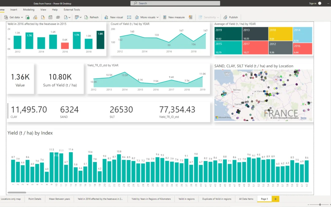
Germany and France Power BI comparative dashboard

Side-by-side market comparison dashboard

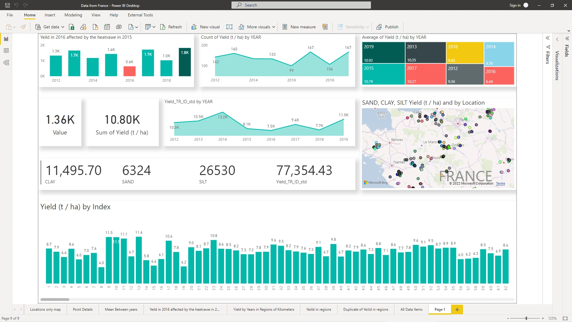
Germany and France analysis detail

Shared filters and consistent measures across markets

Challenge

Comparing two markets side by side without manual spreadsheet work.

What we built

Key decisions.

Comparative dashboards designed for Germany and France in one place.

Shared filters so both markets respond to the same period and dimension cuts.

Consistent measures so totals and rates mean the same thing on either side.

Views organised for counts, groups, trends and time-series analysis.

Result

What changed.

Counts, groups, trends and time-series analysis are available in one comparative view — so market differences are easier to spot and explain.

Start a conversation

Have a similar
challenge?

Oil Market Analysis – From Raw Data in Excel to Story-Telling Dashboard of Microsoft Power BI

Oil Market Analysis – From Raw Data in Excel to Story-Telling Dashboard of Microsoft Power BI

Case study

Power BI

A Power BI dashboard that brings oil market data into one clear view for comparison over time and region.

Data & Business Intelligence

Power BI

Excel

Tableau

Client

Oil market analysis engagement

Sector

Energy · Market intelligence

Services

Data & Business Intelligence

Tools

Power BI · Excel · Tableau

Challenge

Market data sat in separate tables and was hard to compare over time or region, in an Excel file.

What we built

Key decisions.

One modelled dataset combining the source tables into a reliable structure for analysis.

Interactive filters for period, region and product so stakeholders can cut the data their way.

KPI cards for the measures that matter most at a glance.

Trend views that make performance over time easier to read than spreadsheet rows.

Result

What changed.

More than 10 sources in one view — so comparisons no longer depend on manual spreadsheet work.

10+

Data sources unified in one dashboard

Gallery

Selected views.

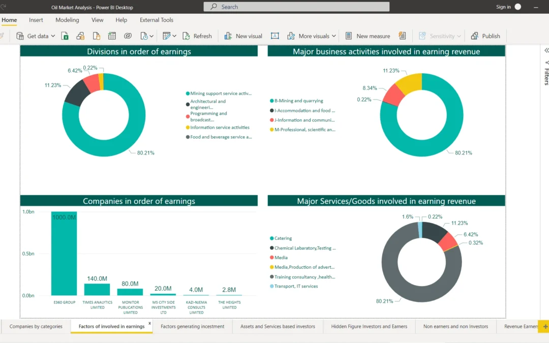
Oil market analysis Power BI dashboard overview

Dashboard overview with KPI cards and trend views

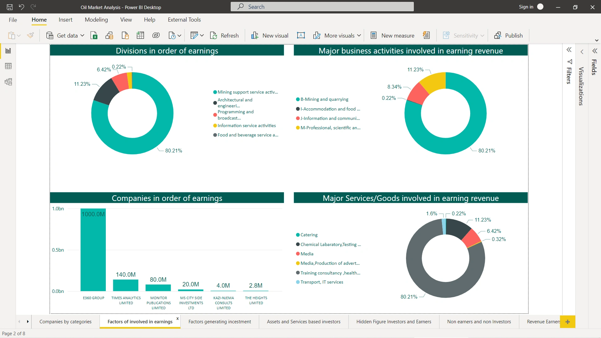
Oil market analysis dashboard filters and detail

Interactive filters for period, region and product

Start a conversation

Have a similar
challenge?